Sunday 22 June 2014

Evaluation

I had intended to end up with three garments inspired by my native american research and that is what I have ended up with. I went back to the British Museum and drew more pictures of artifacts, this time more in depth looking at the shapes and textures of these objects. The last time I went my drawings were very sketchy and quick but over the time of the course I have learnt to give myself more time when it comes to drawing so they end up successful. I wanted to create three garments with a range of textile techniques to embellish them and it is evident that I have done that in what I have produced. I am very pleased that within a few weeks I have created not just one but three successful garments. I faced some technical difficulty when creating the garments but I managed to work out the problems and get them fixed. Some of the dresses were changed slightly so I could end up with a better outcome. I am please with the small collection I have created, I think Its clear to see the inspiration behind the three pieces through the patterns and colours I used. The three dresses were simple in shape and decorative in embellishment and that choice was inspired from the fact that the native Americans would have simple garments but were decorated with beads or embroidery like my collection. I started off by designing my own pattern pieces, I really wanted a princess bodice style dress to make it fit nicer on the body. One of my dresses involved me cutting up strips of fabric and then attaching them onto the fabric using bondaweb, although this process took some time the ending result was beautiful. I love how because of it being handled, the strips of fabric would fray a bit giving it that rustic look which really added to the feel of the dress. One problem I faced when making this dress was the fabric pieces becoming stiff because of the layers of fabric which altered the shape of the dress. However it wasn't nothing a couldn't of darts couldn't fix. Another part of embellishing this dress was the printing which involved me cutting out several templates from freezer paper and then ironing them on and printing over them using fabric paint. Despite the time it look the colours of the strips worked well with the black native inspired printed design. Both techniques worked well together so for that reason I wouldn't change it. To give the dress that finished look rather than adding lining to stiffen it even more I added bias tape to the top and bottom of the dress. Overall I love how this dress turned out, there were times where I thought It wouldn't work but I'm glad that everything did eventually work. I had designed one of my dresses to be full length but I wasn't confident in making it without having my model there so test out the length so I changed it to be short at the front and long at the back so it wouldn't matter as such. Again I made my own pattern pieces to make this dress. To make the shape a bit more dramatic I made the back piece quite long and a bit wider to give the dress more movement and volume when it moves on the catwalk. This dress also took quite some time to make because I was using the technique of melting plastic onto fabric. During my research and experimenting stage I decided to look at feathers, rather than just using feathers I looked at how I could create my own. I was then shown the process of melting plastic onto fabric using a heat press, this technique was something new and something that looked lovely. This meant I had to cut out a load of feather shapes out of plastic to then heat press them on my fabric. It was a fiddly process but it looks really nice on the chiffon. However I soon realized the more I moved and fabric to sew it up the plastic feathers were peeling off. There was nothing more I could do but keep ironing them down which was a little frustrating. If I were to remake this dress I would have to use another method of printing so the feather shapes stayed on the chiffon. Despite the issue of the plastic not working too well on the chiffon It did look lovely, especially when the model walked down in it. Because the dress was see through I made a simple bodycon dress to go underneath it. The third dress I made was inspired by the native american headdress, taking the element of the band and feathers. I used the same princess bodice pattern to make my third dress but taking out some seam allowance because the first time the dress was a bit big. The embellishment for this dress was just in the band and feathers that were going to go on the skirt. The waist band included beading, applique and embroidery which ended up looking beautiful. To make the band look neat I made my own bias tape and sewed it along the edge of the top and bottom. I am very please with how the waist band turned out with the different shapes and colours complimenting each component. The next part of embellishment for this dress was the feathers that were going to go down the skirt however upon placing them on top of the dress I realized it made the dress look cheap and tacky. I really wanted to incorporate the feathers on the dress because it was inspired by the native american headdress so I played around with the positioning of them. In the end I positioned the feathers on the top and at the bottom edge of the waistband. This made the waistband look even more nicer and gave the dress a drawing point for the eyes to look at. The black and red colour scheme of this dress just looked very beautiful and classy. I think the outcome of this dress was alot better than the original design. All the elements of this dress worked well together, just like the other two dresses I made. There are a couple of changed I would make to the one dress if I were to redo it but apart from that I am pleased with the garments I have produced withing a couple of weeks.

(professional pictures to come soon)

Websites used in this project
http://images.google.com/
https://www.pinterest.com/
https://www.tumblr.com/
http://www.britishmuseum.org/explore/cultures/the_americas/native_north_america.aspx

“Fashion is only the attempt to realize art in living forms and social intercourse” - Francis Bacon

After lots if time, handwork and determination we finally got to the day of our fashion show. Obviously it wasn't a stroll in the park but it did end very well with all the garments walking down the catwalk. The day began with trying/ fitting the garments on the models and needing to do any alterations that needed to be done. With 14 students, 5 agency models and lots of clothes you can imagine just how crazy it got at times. Luckily some students had their friends come in to model their garments but for the rest of us it was a crazy day. We got in a make up artist,a nail technician and Toni and Guy to help us out in making sure everything was just amazing. I was worried about my dresses not fitting on the models but luckily I only had to take in only one dress to fit the model right and add a bit of body tape to secure it. We had a run through at around 1'O clock which really tested how fast we could work. There were some people watching the show at that time so we had to do it just as if it was the proper show. Because it was the first time we were doing anything like this it was very chaotic. When a model went out and came back we all had to work quick to get her out and into the next garment and again with the next model that came in. There was no time to take a quick breath because of the fact we had five pro models and lots of garments for them to wear. Luckily with the students friends and videos shown we were able to get the out on time back and changed to send them out again. By the end we got the hang of it and knew just what we were doing. When that finished we went though what we were and weren't going to do for the final show. The run though show really helped us to see how we would work, without it I don't think we would have done as well. It was a long, hot and very tiring day with models still needing to be done up for the final show. Despite all that I was confident that the show was going to be a hit. After a long day, counting down the hours all the garments went out looking fabulous. Although I don't fancy doing another show for a while it was a great day and im proud of the work that we sent out on the day. Hopefully I'm going to get the photos taken by the photographer but for now here are my dresses that I made.

Thursday 19 June 2014

Counting down days

Its gone from counting down weeks to counting down days and as expected the stress levels went up. I did worry for a bit that I would not have 3 completed dresses walking down that catwalk but luckily I did finish them all, the rest it down to how well tomorrow goes. These last couple of days was about finishing everything off making sure they were as good as they could be. This involved sewing up and adding hems to my chiffon dress and hemming up my red dress. I had to make a change to my red dress because it didn't look as nice as I wanted to but I think the change makes it look even better. I'm happy with what I have produced in just a few weeks. That's all for now, we'll just have to hope the fashion show tomorrow goes by smoothly.

Friday 13 June 2014

1 week to go

Surprisingly with 1 week to go I am fairly calm, everything is going well steadily. At this point I have 1 completed dress, 1 base of the dress done and half a dress I need sewing up. There was a lot of sewing up dresses and adding finishing touches to my first completed dress. This week also involved me cutting out a number of plastic feathers for me to heat press onto my chiffon pattern piece. Its a very time consuming process but the look of it is lovely. Hopefully I will get everything I need to by the end of the school week for the fashion show on Friday. As you can tell from the snippet of photos I have been very busy cutting, sewing and embellishing. I am looking foward to looking back at the three finished garments and seeing how they work together. 

Sunday 8 June 2014

2 weeks to go

So it's 2 weeks until our fashion show so the stress levels are high. At this point I'm semi confident that I'll finish on time. At this point I have nearly finished dress one which was inspired by a Native American textiles sample I did. I used a basic dress pattern and from that designed a sweetheart bodice type pattern. I then ironed on bona web onto the pieces so I can then stick the strips of fabric onto the pattern pieces. This dress is decorated with appliqué and printing. The printing involved me cutting out my own stencils from freezer paper and painting using a paint brush and fabric paint. Luckily the paint dried quite fast so I could iron it so secure it and move onto my next process. The appliqué technique involved me cutting strips of a range of fabrics and sticking them on my dress pieces using bondaweb. This process was very time consuming but I think the end results looks quite nice, especially with the frayed edges making it have a rustic look. The pictures are a sneak peek into what I'm going to finish with. 

Wednesday 21 May 2014

Flower printing in photshop

Today we had the privilege of being shown how to design prints in Photoshop by a graphic illustrator/designer. Luckily I knew my way around Photoshop so It wasn't too difficult for me to understand but there were some new buttons that I was learning about. I learnt more about creating beautiful layered images to create one new image. This lesson fit in perfectly with my floral project I was in between doing, It was something extra to add to it. It was so much fun to play around in Photoshop and create a beautiful pattern that could be printed onto a garment.
  

Thursday 15 May 2014

Back to the Museum

Today for my Native American final major project I had to go back to the British Museum to get some drawings done. I went to do some drawings at the beginning of the year but they were more quick and sketchy. I thought It'd be a good idea to go back and refresh my head for this project. My mind was more set of getting good drawings done and I managed to achieve that when I went today. I choose to draw a range of objects with different shapes and texture. I chose not to focus on the colours just because the shapes were beautiful in itself. I'm happy with all my drawings especially the weapon because I feel I got the textures right with the fur and the feathers.

Samples, Samples, Sample


Once again it was a busy week for us as the final weeks creep upon us. This week it was all about samples and trying out a few new techniques. This week I tried printing with freezer paper, both as a stencil and as a transfer paper for mono printing. Both techniques worked quite well in applying shapes of colour. Using freezer paper as a stencil could be a technique use for one of my final garments. As you can see from the images I used the two top left samples to inspire two garments which I think looks really pretty. I then looked at feathers which I took inspiration from the Native American headdresses. Rather than going out and buying quill feathers I thought I would try and make my own. The first sample I did was by using the free-hand foot to create feather shapes on dissolvable fabric (freely sew a feather on plastic that dissolves under water, leaving the shape of stitches). This technique worked really well because the stitches created a feathers texture. One of my tutors suggested that I try the technique of heat pressing plastics together. I had never tried this and was intrigued to see what the end results where. The image above only included some of the samples I ended up with. When I layered these pieces of plastics together and put them under the heat press they had fused together, like one new piece of plastic. I loved how these samples had turned out. When I heat pressed the plastic onto calico fabric it was like it had been printed on, like those T-shirts you get with the plastic/rubbery designs. It was amazing to see how something as cheap as a plastic bag could create such beautiful samples. 
Here is the sample where I heat pressed plastic onto a piece of calico. Because this is a quick, cheap, easy way of making prints I am considered using this technique in one of my final garments. There's no need of paints, stencils, screens just some plastic bags and a heat press. My next step is to create a few more samples and then get designing, hopefully by the end of next week I have three final designs and know what fabrics I am going to be using. 

Almost forgot, on Wednesday we had someone come in to teach us how to use illustrator. I already know how to use Photoshop fairly well but it was great to pick up some tips and tricks and learn about a few new tools. This is something I created using illustrator. 


Sunday 11 May 2014

6 weeks to go...

With 6 weeks left of school left its hard not to get a bit stressed every now and again but like most things you have to just get on with it. On Sunday and Monday I was working on my floral project and ended up with some drawings and prints. After drawing and adding colour to a flower I wanted to look at just the shape of them. I took inspiration from a rose because its a well known shape that people would recognize. Using tracing paper and a bold pen I did repeat pattern of the rose shape. I made them overlap slightly to give it another form and look. I then decided I wanted to make a stamp of some sort to capture the lines and shapes I had just created. I looked around my house and found some cardboard and sting which I used to create a simple but recognizable rose shape stamp. I used this stamp to print onto paper and fabric. Because I did not have fabric paint I had to use acrylic which I had to play around with water to get the right and consistency and to delay the drying time so the paint would transfer onto the paper/fabric rather than just drying up. It was a fun technique to do and I quite like the look of the printing on the organza.
Because Monday was a bank holiday we were in the studio for only 2 days. The first day I went back to my Native American project and did some more research and got inspiration. This final major project is a development from a project I had done a while back that I liked looking into. Because of this I decided to make myself a sketchbook rather than working back into the sketchbook or spending time on portfolio sheet. This way its a bit more free and less cluttered, it will allow me to focus on just drawings and sample rather than the presentation of how I lay things on a page. Starting a whole new clean sketchbook would just make me worry about filling all the pages, this way I can control how much work/pages I do. If I want to I can even add a few more pages at the end and continue. This time round I need to focus alot more on the textile samples and developing them into design Ideas. Hopefully I have enough time to do all this on top of designing and creating some final garments for our fashion show.

Thursday 1 May 2014

Portfolio week


With the end of school creeping up on us we had to schedule out our week so we knew what we were doing when. So this week I planned to work on my portfolio. I had a lot of it done already but I still had a few pages to do and finish. I managed to end up with 10 finished portfolio pages. I just have 2 more to do and I'm done. Part of my pages I did a beading sample that took me around 7 hours over 2 days it was very time consuming but what I ended up with made it worth it. It was discussed that because it took long to make that I could look into other ways of sampling to make it look like beading which could be interesting to explore. As part of the portfolio pages I did I drew and image of a collage I did inspired by a graduated work. I loved how it turned out , it's very similar to the actual collage. Overall it was a well gathered week of completing my portfolio. 

Sunday 27 April 2014

Holiday + First Week Back

So after two weeks of holidays we were back to college with the stress of the finals weeks creeping up on us. I did a bit of sketchbook work in the holidays, designing, researching and sketching. When I got into school straight away I was working on a beading sample, inspired by the colours and texture of a flower. It was time consuming but I loved the end result and how it moved. On an actual this would be much bigger. I went back to my drawing and developed a selection of design ideas. I'm enjoying the drawing element of this project as its letting me focus on shape and colour however im finding the sample ideas hard. The reason for this is because alot they have interesting shape there's not alot of texture and pattern to to create a sample from. However it is getting on well and im enjoying the range of colours in this project.

Friday 4 April 2014

cont; Floral Project

So this week on my floral project I have been looking more at textile and fashion designs. Inspired by my lily drawing I did a free hand embroidery sample using swatches of dark pink fabric to add depth and shading like in my drawing. I think it makes the sample more loose and artistic rather than if I has just added tone using a darker coloured thread. The free had foot gives it that sketchy feel like in my drawings. Using this sample I designed two designs. My next textile move was inspired by Christopher Kanes 2012 collection, he designed these garments using appliqued flowers and organza. I did the same by cutting out flowers and just gluing them under and on top of a piece of organza. I love how my sample turned out its really summery especially with the sparkle of the organza I used. If I were to develop this into a garment I would use floral fabric and stitch them down. Its going to be interesting to look more at how fashion designers have used flowers in their garments.

Sunday 30 March 2014

New week, New project

So this week we were given a new project brief, to respond to a trip to the garden museum. I chose to use the word 'floral' for this project. This project will allow me to really push on the observational drawing element of the project. Especially with spring starting flowers all around are starting to bloom. Already I've drawn a few flowers using a mix of pencils, watercolour and pen. I really want to create a dress inspired by the shape of the flowers rather than making a dress with flowers printed on it. It'll be interesting to see how I can use real flowers to incorporate with my work.

Wednesday 19 March 2014

Independent work; Diy loose babydoll dress


How to draft a top pattern 
First fold piece if pattern paper or just a large sheet of paper in half.
Measurements:
A) neck to bust
B) neck to waist (smallest part of your body)
C) neck to hips (largest part of your body)
D) circumference/width of your bust /4
E) circumference/width of waist /4
F)circumference/width of hips /4
G) 2.5cm 
Notes: I use one pattern for the front and back, for the front I cut a lower neckline
I forgot to put to measure from the neck to the top of the shoulder  
I cut out from a big piece of fabric but you would use about 1.5 meters 

To draft a sleeve use this website http://www.ikatbag.com/2010/08/drafting-part-v-drafting-basic-sleeve.html?m=1 

How to put your dress together
1) Make all your paper patterns, alternitavely you can make patterns from an existing top, check out YouTube for tutorials.
2) Fold your fabric in half and lay the pattern ontop, lining up the folded edges.
3) from the point under the arm draw straight down upto your waist, like in the drawing.
4)If you haven't already, draw your 1.5cm seam allowance (or however many you usually use) around the pattern onto the fabric. Do this twice so you end up with a top and front pece (remember to alter the front neckline).
5) Place your sleeve pattern onto the folded piece of fabric and adding your seam allowance if you haven't already draw around the pattern. Drawing straight down if you want loose sleeves similar to on a Tshirt (the image I've drawn is of a sleeve measuring to the elbow, not of the whole length of the sleeve so alter on the pattern).
6) Use your top waist pattern measurement and times it by 2.5/3  so get a rough width of your skirt piece (basically you want a long piece of fabric long enough so I goes around your top with a bit extra so you can gather it and make it flowy).
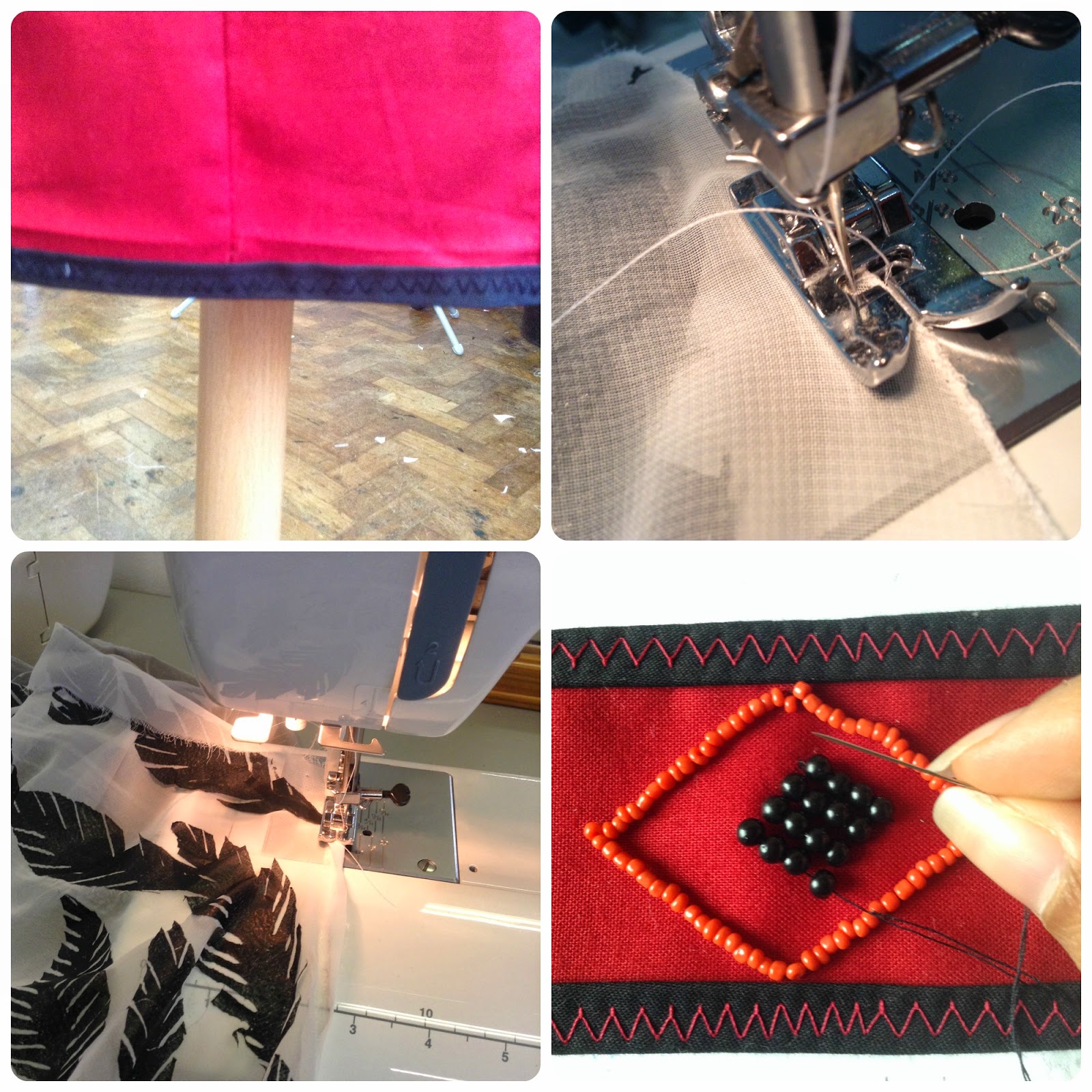
7) Now hem the pieces that you need to, neckline (I find easier to do first), bottom of skirt piece and bottom of sleeve. If your find it easier you can do this right at the end. 
8) Turn the top pieces facing each other, then sew the top of the shoulders together. Then sew in the sleeve making sure you pin it in place and leave some seam allowance to see down the sleeve and down the dress. (Watch some videos on youtuve if you need help doing this part)
9) Sew down the sides of the top and side of the sleeves. 
10) Turn the top right side out, attach with pins the skirt piece on the top piece. Pin down where half of the skirt is to where half of the front/back is, this will give you even gathered sections.

11) I find it easier to gather as I sew but you can pin down the gathers and then sew. 
12) Considering I haven't left anything out you are done and can just iron it flat and then it's ready to wear. 

This is what you should end up, hopefully my instructions where fairly easy to understand if not leave a comment below and I will try and answer them. Hope you guys like the tutorial, this is the first time I've done this so tell me what you think and have fun sewing.

I have seen this type of dress selling for around £50-£60 which is crazy especially when I know I can make the exact same for less than £10. 

Hannah Hoch exhibition


As part of my distortion project I went to see the Hannah Hoch exhibition at the whitechapel gallery. It was something that was advertised at an underground statio so I looked into it and thought if be nice to go and see this artist. She simply but effectively distorts existing images to create new pieces of art. Her manipulation of people especially females fits in with my response to the idea of distorted beauty.
Hannah Hoch was part of Berlins Dada movement in the 1920's. "She was a driving force in the development of 20th century collage" - Whitechapel museum. The Dada movement was the negative reaction to World War 1 in forms of art, literature, poetry and theatre. She would take images from fashion magazines and illustrated journals to create humorous collages using the technique of photomontage. This is where you create a new piece of artwork by joining pieces of photographs. This is different from collages because instead of piecing images to create a moodboard you are using pieces of images to make one new piece. As well as incorporating embroidery to work she would use techniques such as linocut printing to create abstract patterns.This was her way of expressing herself in a time of social and political change. It can be said that her art what very rebellious. It's clear looking at some of her work that she didn't take life too serious and seemed like a fun person. A quote from one of the information boards said "The purpose of art was not to decorate or to replicate reality but to act on behalf of the spirit and the canning values of a generation", I think this was something she said but either way I love the idea if being just free when it comes to art and not trying to copy exactly what you see. Unfortunately I couldn't take any pictures from the exhibitions but there are a few that I found online at the bottom. One of her images titled 'Liebe I'm Busch'(love in the bush) was of a white and black person mixed together, this would have created an ambiguous scene. Although I found some images meaningful there was some that looked like they had been created just for the humour, this is somewhat inspiring as she wasn't creating something that already was there but something new out of existing pieces. It was in 1945 that her art took a different route rather than just collaging she started to experiment with cutting out, rotating and inverting elements of images. Although moving from collaging she created beautiful patterns and artwork. Overall I did enjoy this exhibition, I liked the feel of her throughout her pieces. She was someone who wanted to make people laugh as well as to make them admire her pieces. Hannah Hoch manages to select pieces of photographs to create one new piece of artwork, leaving the person looking at it to interpret the new image and the ideas behind it. It's a simple technique but one that can create lovely new images. 

Staatshaupter 'head if state' - 1918/20

   New York - 1920/21

   Flucht 'flight' - 1931

   Kleine Sonne 'little sun' -1969

Monday 17 March 2014

Evaluation Project : Distortion

So a while ago we were given a new project, to interpret and document our response to a certain word. The choice of words we were given were 'distortion', 'decay' and 'structure' . For me the word that jumped out to me was 'distortion'. The first ideas I got were about shapes being changed, either my breaking or burning them or ripping surfaces like fabrics and other textiles. The first thing I did was scrunched an empty drinks can and then drew it using pencil, pen and then collage. From scrunching the drinks can I was able to distort the shape from a tube to a geometric structure. This reminded me of the health department headquarters in Spain which has a geometric structure. This surface creates a distorted geometric reflection of the outside surroundings. I found an image from which I drew into my sketchbook. This was then developed to make my own distorted, geometric reflection image. Using a few images of London I took myself I cutout pieces and layered them un-lined together to create a broken reflection. To develop this further I took the image to Photoshop editing each segment with filters and effects. Developed into further I drew the new distorted image and like the photoshopped edit I drew each segment using a different media such as pencil, pen, oil pastel and felt tips. Through my research I cam across a graphic deign graduate called 'Ashley Edwards' who collages on top of images using shapes of colour, another image or the image itself. Using an image of Marilyn Monroe I began cutting and puzzling pieces together to create a distorted image but could still tell who the person is. From this I created a textile sample using free hand embroidery and reverse applique to reflect the shapes of colours. Using my version of the collaged image i created a range of fashion designs. I was also inspired by another artist 'Nina Chakrabarti' who decoratively drew on top of photos of women in a non pretty but aboriginal sort of way. I did the same buy taking a page of a woman's face from a magazine and drawing on op of it using decorative lines and shapes. In the same way I found some fashion images from a magazine and drew on top of them, almost re-designing the original garment. I started to like the idea of distorting women but this time look at metal distortion, so the ideas of society and media that harm women mentally. I made a collage of images taken from the internet about beauty and stereotypes. From this I drew my own picture of a girl coloured in standing in a black and white drawn scene making her stand out. This theme inspired a few samples, looking at words. One of the samples looked at the word 'beauty', using a free hand foot on the sewing machine i embroidered the letters to make up beauty leaving the thread uncut to give it that distorted look. The next sample was a print sample of negative words all linked together. Using the idea of distorted beauty I did a range of fashion designs, two looking at a measuring tape being a detail and the other two looking at the idea of revealing true beauty. For last two designs I did a sample of a plain dark fabric being ripped through to reveal a floral beaded fabric underneath. Its this concept that I would like to develop into a garment if I have enough time at the end of the project. Still looking at the distorted image of beauty I looked further into the idea of the perfect body, making a collage of images and campaign posters. Inspired by two photos I drew a girl but with half of her being a skeleton with the caption "Dead Girls Are Skinnier". I liked how modern and eye opening the picture was, showing that to some people there will always be something/someone that looks better. Sticking with my drawing I did another three copies using ink pen and the other two using felt-tips, playing with different colours. Once again developed even further I scanned them into Photoshop and manipulated them by adding colour and pattern to the skeleton  section to make it look quirky. Using the same drawing I did a textile sample using applique, beading and pen to draw onto the fabric. Finally with the Photoshop images I designed three garments that I could see people wearing. Overall this has been a fun project to do, I like how I went from physical distortion to mental distortion and the ideas surrounding beauty. I'm really pleased with how my ideas have developed into samples and the garments. If I could go back I would look at more distortion of objects and trying to change the shape of them by breaking or melting them. This project has given me a chance to look at not just designs and making something that looks good but to have a message behind it. The ideology of beauty is something that currently is being explored in todays society, thats why this project for me has become so meaningful.